
You download the app. You set up an account. You pick your categories, choose a theme, configure your break sounds, decide how many Pomodoros before a long break, enable the streak tracker, connect it to your calendar.
Then you close it and never open it again.
This isn’t a willpower failure. It’s a design failure — and for ADHD brains specifically, complex interfaces aren’t just annoying. They’re functionally inaccessible.
The Setup Tax ADHD Brains Can’t Afford
Every step between “want to focus” and “actually focusing” has a cost. Neurotypical users pay it and move on. ADHD brains, which already struggle with working memory and task initiation, often can’t afford it at all.
Research on digital app adoption shows that users abandon applications with excessive setup requirements at higher rates. Interfaces requiring multiple decision points before you can start create friction that disproportionately affects users with attention and executive function challenges. One-tap designs demonstrate significantly higher session frequency compared to interfaces that require multiple choices before you could start.
A digital health study by Donker et al. (2013), published in JMIR Mental Health, tracked users over six weeks and found that applications with simpler entry points showed better retention rates. The mechanics are consistent: friction predicts dropout.
Working Memory Is Already Maxed Out
Here’s the neurological reason this matters more for ADHD than for most people.
Research on ADHD and working memory has consistently found measurable deficits in working memory capacity among those with ADHD diagnoses. Working memory is the mental scratchpad you use to hold context while navigating decisions. When that scratchpad is already under strain, every menu, every toggle, every configuration option drains it further.
This is why the common productivity app sales pitch — “powerful, feature-rich, fully customisable” — translates directly to “probably not built for you” if you have ADHD. Features aren’t free. Each one sits in your visual field demanding a micro-decision: do I need this? Should I configure it? What does this setting do?
Research on cognitive load and interface design shows that interfaces with more visual elements and complexity produce higher cognitive load in users with attention difficulties. Most popular productivity apps have dozens of visible interface elements on a single screen.
Decision Fatigue Before You’ve Done Anything
There’s a specific failure mode that ADHD users describe repeatedly: opening an app to help you start working, getting lost in the app itself, and eventually closing it without having started.
This isn’t ironic. It’s predictable. The same executive function systems that make starting tasks hard — the ones regulated by dopamine-driven circuits in the prefrontal cortex — are the ones you’re burning through when you configure your timer.
By the time you’ve chosen your session length, your break length, your background sound, your notification style, and whether to enable “deep focus mode,” you’ve spent the activation energy that was supposed to get you into the actual task. The app consumed the resource it was meant to preserve.
This connects directly to what researchers call the “initiation cost” — the cognitive overhead required just to begin. Research has shown that reducing interface friction can decrease task initiation latency. Simplicity doesn’t just feel better for ADHD users. It functionally changes whether they start.
If you want to go deeper on why task initiation is so hard neurologically, this breakdown of the wall of awful and shame cycles in task initiation explains the emotional layer that runs underneath the executive function deficits.
What “Minimal” Actually Means (It’s Not Just Aesthetics)
Minimal design gets discussed as a visual preference — clean lines, white space, calm colours. But for ADHD users, minimalism is a functional requirement, not an aesthetic one.
A genuinely minimal app for ADHD has a few specific properties:
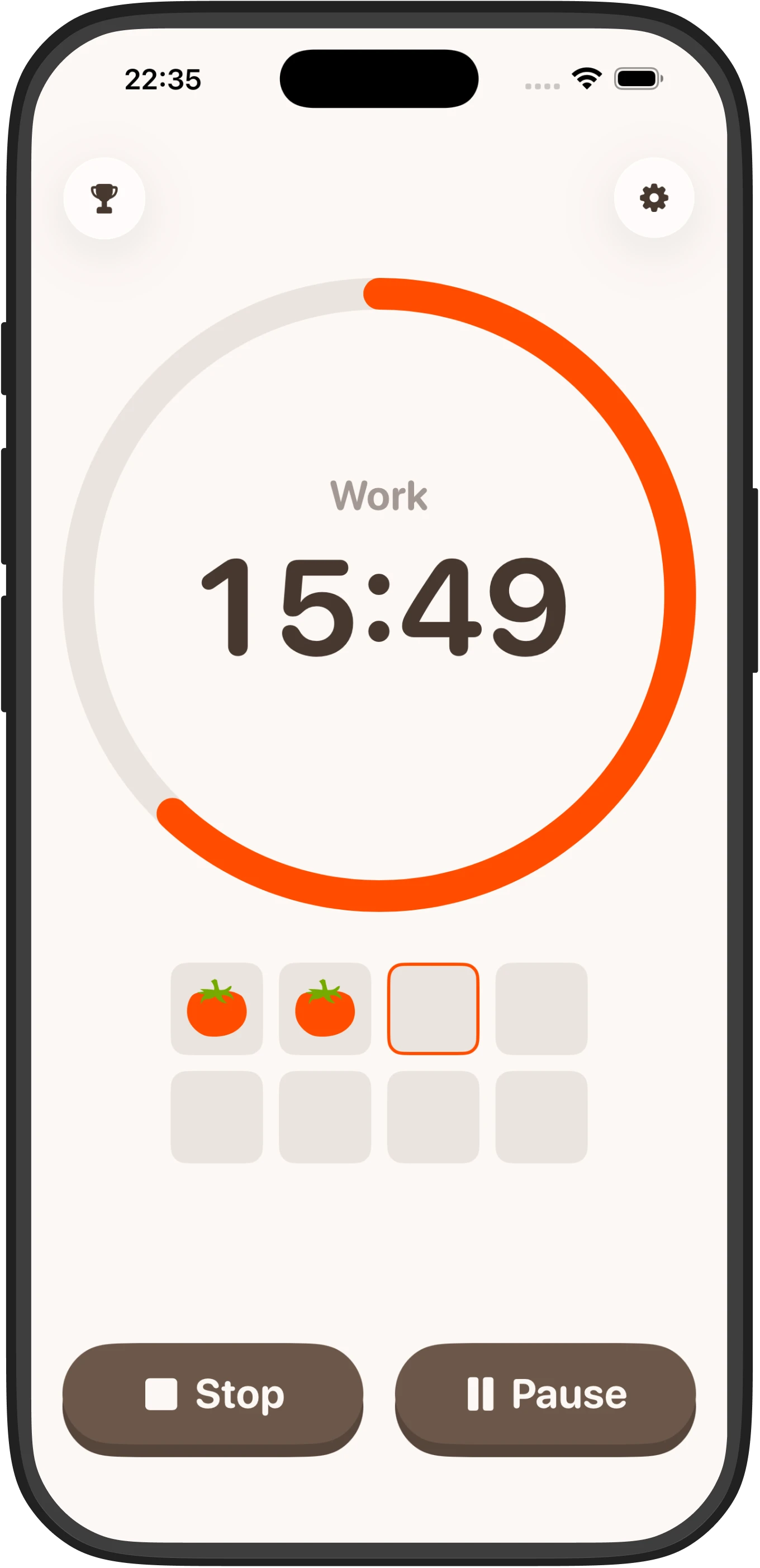
- One action to start. Open the app, tap once, session begins. No choices required before the timer runs.
- No account gate. Account creation means email addresses, passwords, verification links, profile setup. That’s multiple steps before you’ve done anything. For an ADHD user at 8pm trying to study, it’s a full stop.
- No configuration required. Sensible defaults that work without being touched. Customisation can exist, but it should never be mandatory before use.
- No ambient distraction. Dashboards, stats panels, habit graphs, achievement badges — all of these are things to look at instead of working. A focus tool shouldn’t compete with the task for your attention.
- Offline-first. Requiring a network connection adds a dependency. Dependencies are friction. They’re also points of failure on low-connectivity days.
The research framing here is accessibility. When we say a wheelchair ramp is an accessibility feature, we mean it removes a barrier that exists for some users but not others. One-tap design is the ramp. Complex interfaces are the stairs.
If you’re evaluating your options, this comparison of minimal timers versus complex productivity apps breaks down the tradeoffs in more detail.
Why Streaks Work Where Features Don’t
Here’s a counterintuitive point: minimal doesn’t mean featureless. It means that every feature present should earn its space by solving a real ADHD problem.
Streaks, for example, seem like a gamification gimmick, but there’s a genuine neurological basis for why they help ADHD users. Dopamine systems in ADHD are underresponsive to delayed rewards. The inherent reward of “I was productive today” is too abstract and too far from the action to reliably reinforce behaviour. A visible streak provides an immediate, concrete, proximate reward signal — you can see it right now, and you don’t want to break it.
That’s a feature worth having because it compensates for a specific ADHD deficit. It’s not just decoration.
The same logic applies to designing away decision fatigue. A timer app that follows this design philosophy would be offline, require no account, offer one tap to start, and use streaks to make the habit stick. It’s the kind of tool that works precisely because it doesn’t ask much of you before you’ve started.
This is the design philosophy that the research supports: remove every barrier to starting, then add exactly the minimum reward signal needed to make repetition likely.
The Abandonment Loop and How to Break It
Many ADHD users have been through this cycle multiple times. You find a promising app. You’re motivated (novelty activates dopamine briefly). You set it up. You use it two or three times. Life interrupts. Coming back feels complicated. You abandon it. You feel bad about abandoning it. That bad feeling makes you slightly less likely to try the next one.
The abandonment loop isn’t just an inconvenience. It’s a shame accumulation problem. Every abandoned app is a small piece of evidence your brain files under “you can’t stick to things.” That accumulation is real, and it matters.
Breaking the loop means choosing tools that are cheap to return to. If coming back after a week off requires you to remember your login, reset your settings, and re-engage with a complex interface, the re-entry cost is high. If it requires you to open an app and tap a button, the cost is near zero.
Low re-entry cost is a feature.
FAQ
Why do ADHD users abandon productivity apps more often than others?
ADHD brains have reduced working memory capacity and higher task initiation friction, so complex setup requirements drain the activation energy needed to actually start working. Each menu, toggle, and configuration option costs cognitive resources that neurotypical users can more easily afford.
What is the “setup tax” and why does it affect ADHD differently?
The setup tax is every step between wanting to focus and actually focusing. For ADHD users whose working memory and executive function are already strained, setup tasks consume the dopamine-driven activation energy that was supposed to fuel the actual work.
Can a timer app with streak tracking really help ADHD users stick to habits?
Yes, because ADHD dopamine systems are underresponsive to delayed rewards but responsive to immediate, concrete signals. A visible streak provides real-time reinforcement that makes repetition neurologically more likely than abstract rewards like “I was productive today.”
Is minimal design just about aesthetics, or does it actually change ADHD outcomes?
Minimal design is a functional accessibility requirement, not an aesthetic preference. One-tap interfaces measurably reduce task initiation latency and improve session frequency for ADHD users by removing the cognitive barriers that prevent starting.
What makes an app “re-entry cheap” for ADHD users?
An app with low re-entry cost requires no login, remembers settings automatically, and starts immediately with a single tap. After a week away, you can open it and resume without friction, whereas complex interfaces with login walls and configuration screens create high re-entry costs that discourage return.